.png)
Merge
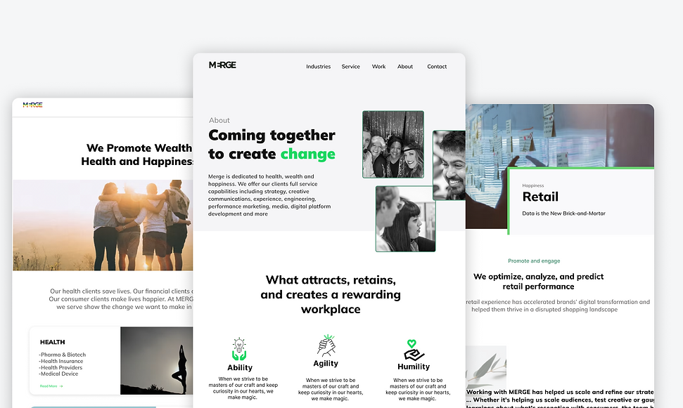
I redesigned the MERGE website, which provides clients with marketing and technology consulting services. Along with enhancing the site's UI design, I refined the information architecture to enhance user satisfaction.
RESPONSIBILITIES
TYPE
Set up brainstorming sessions
UX/UI final design
Interactive mockups
UX Design internship project
DURATION
3 months
Introduction
In this intern project, I have redesigned the MERGE website to make it more inclusive and accessible while ensuring users find what they are looking for easily and quickly.
Meet the Team

Problem
In what ways can we condense information to help users find out more about what merge has to offer in a more intuitive way and with more breathing room to foster curiosity and inclusion?
Solution
Redesigned the MERGE website that is more user intuitive, easier and faster to find information and more interactive.
Empathize
Research
Wireframing
Process
Final Design
Synopsis
Mergeword.com is a website that encourages users to feel included and to participate in the site. Current users are able to know that Merge cares about the people they work with and strive to give the best experiences. It is recommended that bringing in a more minimalistic approach, condescending the information that is given, and reorganizing the information of the architecture would lead to a lower exit rate. Our Audience include
-
Potential Acquisitions
-
Potential Clients
-
Future Employees
Research
To gain a better understanding of how we could more effectively address this problem, we conducted a series of user interviews and surveys. Questions we asked included:
-
Tell us more about what information you usually look at on MERGE website.
-
How do you access information about finding open jobs on the MERGE website?
-
What factors influence you the most when deciding which organizations/companies you want to work with?
-
What stops you from exploring the MERGE website further?
Competitive Analysis
Competitors to merge focus on building relationships with clients and defining their business structures. MERGEs competition falls into three types of agencies:
Advertising/communications, experience strategy/ design, and technology consulting/development.
I looked at some competitives' dashboard to find inspirations. This is what i took away:
Strength
-
Short and to-the-point what they do and their goal
-
Speak to both their work and their services
-
Clear branding
-
Work is displayed prominently
-
Clear Mission
-
Clear Definition of who the are
-
Simple and easy to use
Weakness
-
Focuses on grabbing the user's attention rather than the message of the business
-
Wordy
-
Long clocks of information
-
Unclear capabilities
-
Lack of intuitive UI
Recommendations
Less is More
01
The website leaves users confused with an abundance of information with few ways to distinguish what is important and leaves users to feel like they are endlessly scrolling. By limiting the amount of copy used, users will know where to focus on.
A label is Worth a Thousand Words
02
There are multiple areas of the website that leave the user to fend for themselves. By incorporating more labels, users would be able to know what they are looking for. By adding more copy users will have support while they are experiencing different sections of the site.
03
Safe Space
The brain naturally uses white space as a place for users to breathe and collect their thoughts. White space is used for users to be able to digest their information and ask more questions. At the moment there is a lack of space to allow users to breathe. By adding more white space with less noise, users will be more successful in reaching their goals and recommending MERGE elsewhere.
Ideation

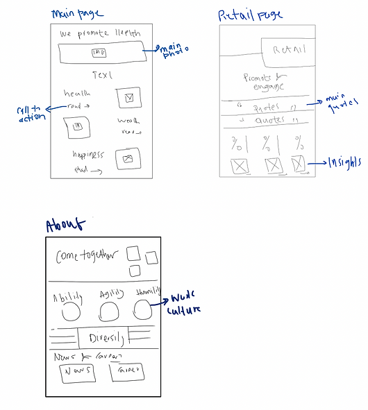
Design
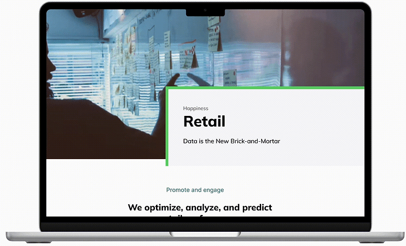
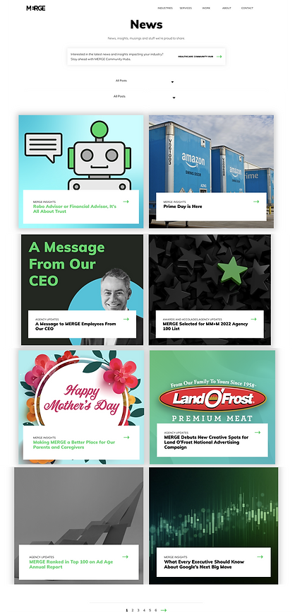
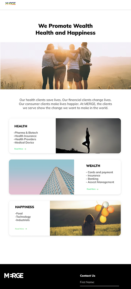
Here I moved to the final design. focusing on the visual element, hierarchy, and typography while keeping in mind solving the users' problems.
01
STRATEGY PAGE
Before

After

02
ABOUT PAGE
Before
.png)
After

03
RETAIL PAGE
Before

After

03
NEWS PAGE
Before
.png)
After

04
LANDING PAGE
Before

After
.png)
Learning
-
I had the opportunity to collaborate across different departments and engage with diverse clients. This experience enabled me to gain insights into their desires and requirements, gather feedback, and iterate on our approach accordingly.
-
I have developed the ability to efficiently prioritize tasks and manage my time effectively, even when faced with the demands of multiple projects
-
I have gained proficiency in tailoring designs to match each client's initial design, incorporating modifications or additions to their system while adhering to their design system and addressing their specific wants and requirements
Previous Work
Next Work